Showing posts with label Desmos. Show all posts

Friday, February 21, 2014

a bit of ex-spline-ation

Splines are piecewise-polynomial functions that interpolate between a finite set of specified points $(x_1,y_1)$, …, $(x_n,y_n)$. Cubic splines assume that each piece has at most third degree; this allows the formation of curves that appear quite smooth to the eye, as one has sufficient freedom to match both first and second derivatives at the joining points. Either the first or second derivative may be chosen freely at the first and last points; in the case of natural cubic splines, the assumption is that the second derivative vanishes at those points. I spent part of this week trying to understand how they work, and so I decided to make Desmos graphs that would illustrate how to interpolate by cubic splines for sets of three and four points.
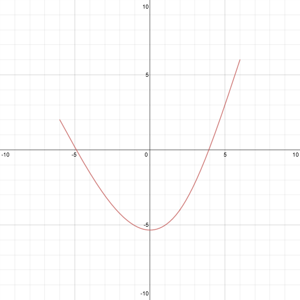
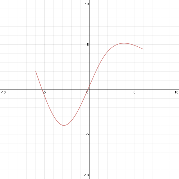
Click on the left image to go to the graph with three points,
or the right image to go to the graph with four points.

The process I followed for three points was straightforward, if not lovely. Suppose the interpolating functions are $f_1$ and $f_2$. The assumption that $(x_1,y_1)$ and $(x_3,y_3)$ are inflection points means that $f_1$ and $f_2$ have the form \[ f_1(x) = a_1 (x - x_1)^3 + b_1 (x - x_1) + y_1 \] and \[ f_2(x) = a_2 (x - x_3)^3 + b_2 (x - x_3) + y_3 \] (think in terms of Taylor polynomials around $x_1$ and $x_3$). We need to find the coefficients $a_1, b_1, a_2, b_2$. Two conditions arise from the fact that $f_1(x_2) = f_2(x_2) = y_2$. The condition that the second derivatives match at $x_2$ implies $a_1 (x_2 - x_1) = a_2 (x_2 - x_3)$. The fourth and final condition is that the first derivatives match at $x_2$, and now the system can be solved to find $f_1$ and $f_2$ entirely.

While preparing to make a graph for four points, I came across a post on the Calculus VII blog that breaks down the whole process of computing splines in a clever and beautiful way, which also reduces the complexity of the computation. In addition, the post provides, in rough outline, a motivation for why natural cubic splines are a good choice for interpolation, and I recommend reading the whole thing. I did have to work out several of the details for myself, however, particularly since that post only deals with $x$-values spaced one unit apart. I thought that it might be useful for others to see the process that led to the formulas I use on the graph. Lots of algebra ahead.

We start with four points, $(x_1,y_1)$, $(x_2,y_2)$, $(x_3,y_3)$, and $(x_4,y_4)$, with $x_1 < x_2 < x_3 < x_4$. The first observation is that the easiest kind of interpolation is piecewise-linear, so we compute the three slopes \[ m_1 = \frac{y_2 - y_1}{x_2 - x_1}, \qquad m_2 = \frac{y_3 - y_2}{x_3 - x_2}, \qquad m_3 = \frac{y_4 - y_3}{x_4 - x_3} \] for the three segments between successive pairs of points, and the linear functions $L_1$, $L_2$, and $L_3$ corresponding to this interpolation, $L_i(x) = m_i (x - x_i) + y_i$.
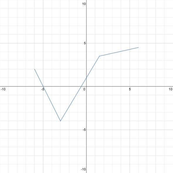

Linear interpolation

The next big idea is that we want to adjust the piecewise-linear approximation by adding cubic “correction” terms $C_1$, $C_2$, and $C_3$, so that our final interpolating functions become $f_i = L_i + C_i$, $i = 1,2,3$, where $C_i(x_i) = C_i(x_{i+1}) = 0$. These latter conditions imply that $C_i$ can be written in the form \[ C_i(x) = a_i (x - x_i) (x - x_{i+1})^2 + b_i (x - x_i)^2 (x - x_{i+1}), \] which means that the first and second derivatives are \[ C_i'(x) = a_i (x - x_{i+1})^2 + 2(a_i + b_i) (x - x_i) (x - x_{i+1}) + b_i (x - x_i)^2 \] and \[ C_i''(x) = (4a_i + 2b_i) (x - x_{i+1}) + (2a_i + 4b_i) (x - x_i). \] Note also that $f_i' = m_i + C_i'$ and $f_i'' = C_i''$.

What other properties do we want these cubic functions to have?

  • For the derivatives of the $f_i$s to match at $x_2$ and $x_3$, we must have $m_i + C_i'(x_{i+1}) = m_{i+1} + C_{i+1}'(x_{i+1})$ for $i = 1,2$.
  • We want the second derivatives of the $C_i$s to match at $x_2$ and $x_3$ (this is the same as matching the second derivatives of the $f_i$s).
  • We also require that the second derivatives be zero at the outer endpoints.
Now a curious twofold effect comes into play:
  • The coefficients $a_i$ and $b_i$ are linear combinations of $z_i = C_i''(x_i)$ and $z_{i+1} = C_i''(x_{i+1})$. To wit, solving the system \[ \begin{cases} z_i &= (4 a_i + 2b_i) (x_i - x_{i+1}) \\ z_{i+1} &= (2a_i + 4 b_i) (x_{i+1} - x_i) \end{cases} \] for $a_i$ and $b_i$ yields \[ a_i = \frac{2z_i + z_{i+1}}{6 (x_i - x_{i+1})}, \qquad b_i = \frac{2z_{i+1} + z_i}{6 (x_{i+1} - x_i)} \]
  • The condition that the second derivatives be equal is exceedingly simple; we have already used it implicitly in labeling them as $z_1$, $z_2$, $z_3$, $z_4$.
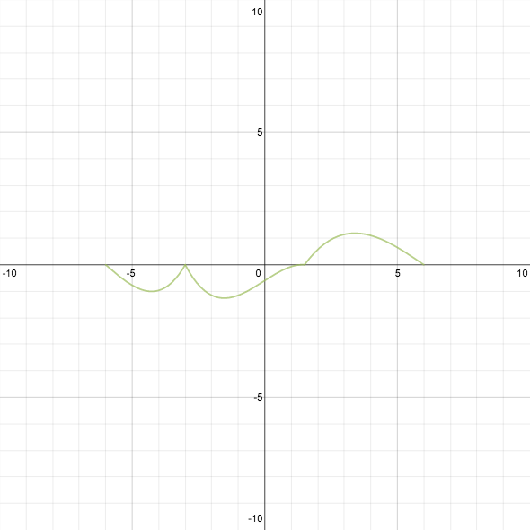
Our assumption at the endpoints is that $z_1 = z_4 = 0$. Thus, the whole problem reduces to finding what should be the second derivatives at the “interior” points $x_2$ and $x_3$.


Cubic correction terms

The idea of parametrizing by the second derivatives, after removing the “linear” effects, is where the beauty and cleverness in this solution lie. We use the assumption about matching first derivatives (a linear condition in the coefficients) to set up the remaining conditions on the second derivatives (which themselves depend linearly on the coefficients). Looking back, this is essentially what I did for three points, but I missed out on dealing with the linear effects separately, so I had to solve for three variables simultaneously. At this point, we only need to solve for two: $z_2$ and $z_3$.

Since $C_i'(x_i) = a_i (x_i - x_{i+1})^2 = \frac{1}{6} (2z_i + z_{i+1})(x_i - x_{i+1})$ and $C_i'(x_{i+1}) = b_i (x_{i+1} - x_i)^2 = \frac{1}{6} (2z_{i+1} + z_i)(x_{i+1} - x_i)$, the equations $m_i + C_i'(x_{i+1}) = m_{i+1} + C_{i+1}'(x_{i+1})$ become \[ \begin{cases} (x_2 - x_1) (2z_2 + z_1) + (x_3 - x_2) (2 z_2 + z_3) = 6(m_2 - m_1) \\ (x_3 - x_2) (2z_3 + z_2) + (x_4 - x_3) (2 z_3 + z_4) = 6(m_3 - m_2) \end{cases} \] (in this form, it is easy to see how to generalize to $n$ points, and it shows the origin of what the other post called the “tridiagonal” form of the system). Now we set $z_1$ and $z_4$ to zero and solve for $z_2$ and $z_3$. For this two-variable system it isn’t too bad to write down the explicit solution, which is what is used in the Desmos graph: \begin{gather*} z_2 = 6 \frac{3 m_2 x_2 + 2 m_1 x_4 + m_3 x_2 - 2 m_1 x_2 - 2 m_2 x_4 - m_2 x_3 - m_3 x_2}{(x_2 + x_3)^2 - 4 (x_1 x_2 + x_3 x_4 - x_1 x_4)} \\ z_3 = 6 \frac{3 m_2 x_3 + 2 m_3 x_1 + m_1 x_2 - 2 m_2 x_1 - 2 m_3 x_3 - m_1 x_3 - m_2 x_2}{(x_2 + x_3)^2 - 4 (x_1 x_2 + x_3 x_4 - x_1 x_4)} \end{gather*}
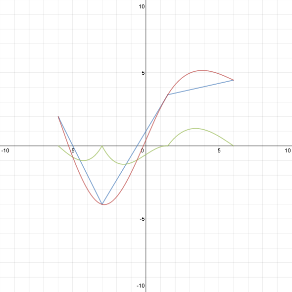

In this graph, blue plus green equals red.

Finally, to check that we have actually created a spline with the desired properties, we can look at the graphs of the first and second derivatives to make sure they’re continuous.
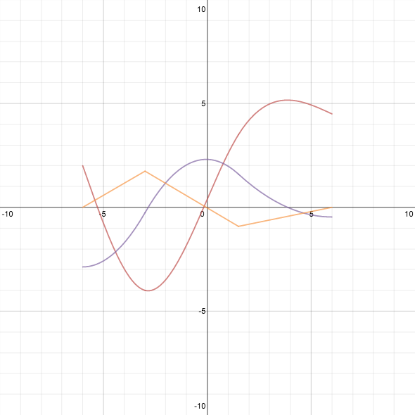

The spline is red. The first derivative is purple, and the second derivative is orange.

Notice that the second derivative is piecewise linear (naturally, since the spline is piecewise cubic) and zero at the endpoints (as we chose it to be). I particularly like seeing how the derivatives change as the points are moved.

Anyway, I learned a lot from putting together the graphs, and almost as much from writing this post. I think there are lots of interesting explorations one could do with these graphs, but for now I’ll just release them to the wild and hope people enjoy them!


P.S. Please pardon the bad pun in the title. I’m working on making my post titles more… interesting?

Monday, December 16, 2013

some of my favorite Desmos projects from this semester

Important note: You can click on any graph in this post to go to an interactive version. The interactivity is kind of the whole point, so please do take a few moments to experiment with some of these.

At the start of last summer, I announced that the Desmos graphing calculator had sold me on its usefulness “after just a few minutes of playing around”. Since then, the Desmos team has added a lot more features, without ever sacrificing user-friendliness (which, for those of us using Desmos to teach, is paramount).

During the fall semester, I used Desmos extensively in my calculus classes at Smith College. I made “worksheets” that allowed students to interact with mathematical ideas in an incredibly direct way; I also had fun creating them. Eventually I figured out that Desmos and Google docs could be used together to make more fully developed worksheets. (A brief word about my teaching situation: at Smith, all students have a Google account for their email, and thus all have a school-related Google drive by which documents could be shared. On days we used worksheets, about half of the students would bring in laptops, and they would work in groups of 2–3. At the end of class, or afterwards if they had sections to finish, they would share their work with me so that I could review it.) I’ve shared some of these worksheets over time, but I thought it would be nice to have some of my favorites collected in a single place. For simplicity, I’ve removed a bunch of the “worksheet” structure to these, so that they have become more like demonstrations others can use as they wish. Not all of these were used in class, as sometimes I just had to play around with some ideas.

First, some play. That you could not only define variables but also define functions in a Desmos graph and use them elsewhere came as a revelation to me, as did the fact that you could create sums with a variable number of terms. I first learned this while adding up sine functions à la Fourier sine series, which I wrote about here. After that, I made the blancmange curve, a classic example of a continuous but nowhere-differentiable function:

The ever-responsive and ever-creative Desmos team turned the blancmange curve into a mountain range, with a setting sun and moving train (you’ll definitely want to play with this one):

Onto the calculus demonstrations. Teaching calculus in the fall almost always leads to introducing derivatives near the equinox, around the time that days are getter shorter at their fastest rate. I have in the past just mentioned this as an illustration of the derivative. This fall, however, I had students explore how the changing amount of daylight is affected by time of year, latitude, axial tilt, etc. Here, for instance, is a graph depicting the amount of daylight on each of the year at latitude 35°N:

Here is the amount of daylight each day at latitude 50°S:
And here’s what the amount of daylight would be like just a few degrees away from the equator, if Earth had the same axial tilt as Uranus (about 82 degrees):

Optimization takes up a chunk of time after derivatives have been introduced. Several classic problems deal with boxes whose surface area must be minimized, or whose volume must be maximized, under various constraints. I’ve always suspected students have trouble imagining what it means, for instance, to require a box have a square base and a fixed volume. What do the various shapes of such boxes look like? So I made a simple model of an open-topped box whose volume and base side length could be manipulated:

Then integration rolls around, with the requisite Riemann sums. Between the introduction of sigma notation, Δx‘s, and a host of other notation, it’s easy for students to feel like they have no idea what is going on. A picture can clear things up, because the idea is quite simple, but drawing enough pictures to show what it means for Riemann sums to converge can take an incredibly long time. Isn’t it nice that we can just show this now?


(I adapted this from another Riemann sums demonstration, made by Evan R.)

In discussing differential equations, we took a day to look at the logistic model of population growth. I asked on Twitter if anyone had a suggestion for real-world data to base a project on. Lia Santilli came up with a great idea I would never have considered: the number of Starbucks locations open t years after the company started. I had the students create a table using the data available here, then try to match the data as nearly as possible with a logistic curve. Here was my attempt:

What I like about this example is that you can see how difficult it is to distinguish between exponential and logistic growth early on. Right up until the inflection point of the logistic curve, the growth seems exponential, and so naturally the company continues that growth trend for another few years. But as the market reaches saturation, it becomes clear that they’ve overshot the mark, and one year (2009) they actually have to close more locations than they open. After that, the growth is more restrained. I don’t know if the 20,000 locations I built into my model is actually the largest sustainable number for this “population”, but I like the challenges for management highlighted by this analysis.

I also used Desmos a few times in my probability class for illustrations. I wrote about one example here. By using the built-in floor functions and combinations, it’s easy to show what various probability distributions look like, and how they change with the various parameters. For example, here is the probability distribution for the number of times a coin comes up heads in 20 tosses, if it is weighted so that it comes up heads 70% of the time (the vertical dotted line indicates the expected value of 14):

The ability to change parameters also makes it possible to nicely illustrate the Central Limit Theorem. Here, for instance, is a graph showing the standard normal distribution (black), the distribution of an exponential random variable (blue), the sum of ten such random variables (green, heading off the right side of the graph), and a normalization of the sum to have mean 0 and variance 1 (red):
You can see the convergence of the sum to a normal distribution beginning.

Finally, I also found Desmos useful for illustrating parts of my research. One of the dynamical systems I’m studying is related to the three-cusped hypocycloid, or “deltoid”, which is traced out by a point marked on the circumference of a circle rolling around the inside of a circle three times the size:

Each point inside the deltoid lies on three tangent segments:
Perhaps most exciting for me was when I discovered that all the pedal curves of the deltoid could be easily seen and manipulated. A pedal curve is determined by the orthogonal projections of a fixed point onto the tangent lines of the deltoid:

The pedal curves in the above examples were drawn using explicit parametrizations. They can also be defined implicitly by fourth-degree polynomial equations. Since Desmos recently added the ability to plot implicit curves where both variables appear with degree greater than 2, I thought I’d share another, simpler graph that illustrates this functionality:

So that’s an assortment of things I’ve done with Desmos over the past few months, some big, some small. For teachers planning to use Desmos with their students, I would make the following suggestions:

  1. Draw them in with something interactive and manipulable. Teach them early to recognize that different shapes can be given by the same formula simply by changing a few parameters, and to explore the effects that the parameters have.
  2. Get them to create their own graphs. In the past, we had to do all the work to create the worksheets and the models, but now students can be enabled to build their own; when they do, they will benefit from creating, not just responding.
  3. Give them questions that require thoughtful use of the technology they have; simply having access is not a panacea. For example, real-world problems often have models that call for very different scales on the vertical and horizontal axes. Students can be tempted just to use the zoom buttons, causing them to miss important details. Make sure they know they have to think about the graphs they’re creating, not just rely on the computer to show them everything, because it won’t.
For everyone, I encourage widespread use of Desmos and similar tools for education, illustration, research, and entertainment. The Desmos development team deserves an immense amount of thanks for providing us with such graphing and computational power.

Added 12/17– Check out these other graphs for calculus, made by Patrick Honner: http://mrhonner.com/desmos

Wednesday, June 12, 2013

another experiment

(This post is an experiment in two senses. First, to test embedding graphs from the Desmos calculator into the post. Second, to show the results of a mathematical experiment carried out on Desmos and Twitter last night.)

In Spivak’s classic textbook Calculus, one exercise asks the reader to show that each of the following (complex) power series has radius of convergence 1: \[ \sum_{n=1}^{\infty} \frac{z^n}{n^2}, \hspace{0.5in} \sum_{n=1}^{\infty} \frac{z^n}{n}, \hspace{0.5in} \sum_{n=1}^{\infty} z^n. \] (I’ll leave that task to you. Hint: ratio test.) Another exercise then says, “Prove that the first series converges everywhere on the unit circle; that the third series converges nowhere on the unit circle; and that the second series converges for at least one point on the unit circle and diverges for at least one point on the unit circle.” Points where a series converges always raise a new problem: can we tell what value it converges to? Generally, that problem is hard. But at a point where a series is known to diverge, the story’s over, right? Well, no. There are many ways for a series to diverge.

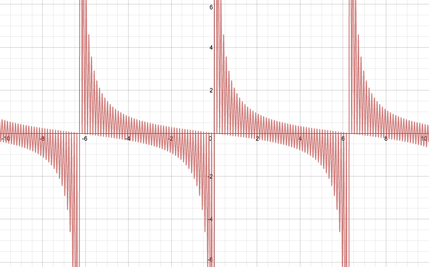
I want to focus here on the behavior of $\sum z^n$ when $|z| = 1$. The series diverges, of course, because the size of every term is 1. But what do the partial sums look like? What do their real and imaginary parts look like? My thoughts on this began last night when I plotted the graph of $\sum_{n=1}^{50} \sin nx$:

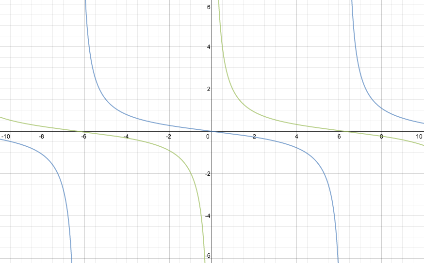
(Click on the graph to go to an interactive version.) To my surprise, there appeared to be well-defined curves bounding the top and bottom of this graph. To be more precise, the points corresponding to critical values (or local extreme values) of the function lie on a pair of analytic curves. After some playing around, I found these curves to be the graphs of ${-\frac{1}{2}} \tan \frac{x}{4}$ and $\frac{1}{2} \cot \frac{x}{4}$ (shown in blue and green, respectively, below).
I sent out a tweet about my discovery: I went investigating and found some hints that this behavior might be related to the Fourier series of the cotangent. Meanwhile, my tweet generated some interest, including this response: Also, later in the evening, Desmos took my initial graph and augmented it: Paul’s on the right track, which brings us back to the Spivak exercise I mentioned earlier.

To get a point of the unit circle, write $z = \mathrm{e}^{ix}$, with $x \in \mathbb{R}$. Then the summation formula for partial geometric series yields \[ 1 + \mathrm{e}^{ix} + \cdots + \mathrm{e}^{imx} = \frac{1 - \mathrm{e}^{i(m+1)x}}{1 - \mathrm{e}^{ix}}. \] We can take imaginary parts of both sides and use some trig identities to get \[ \sin x + \cdots + \sin mx = \frac{\cos \frac{x}{2} - \cos \big(m+\frac{1}{2}\big)x}{2 \sin \frac{x}{2}}. \] (Note that Desmos included this latter formula in their augmented form of the graph. See also this nice derivation.) On the other hand, the tangent half-angle formulas give us \[ -\tan \frac{x}{4} = \frac{\cos \frac{x}{2} - 1}{\sin \frac{x}{2}} \qquad\text{and}\qquad \cot \frac{x}{4} = \frac{\cos \frac{x}{2} + 1}{\sin \frac{x}{2}}. \] When $\sin\frac{x}{2}$ is positive (for example, when $0 < x < 2\pi$), we have \[ -\frac{1}{2} \tan \frac{x}{4} \le \sin x + \cdots + \sin mx \le \frac{1}{2} \cot \frac{x}{4}, \] with equality on the left whenever $\cos\big(m+\frac{1}{2}\big)x = 1$ and equality on the right whenever $\cos\big(m+\frac{1}{2}\big)x = -1$. The direction of the inequalities is reversed when $\sin\frac{x}{2} < 0$, but the rest of the analysis remains the same. This is the desired result.

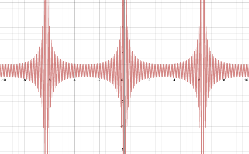
Thus the imaginary parts of the partial sums of $\sum \mathrm{e}^{inx}$ are always contained between $-\frac{1}{2}\tan\frac{x}{4}$ and $\frac{1}{2}\cot\frac{x}{4}$. To complete the picture, let's look at the real parts. Here is the graph of $\sum_{n=0}^{50} \cos nx$:

Using similar arguments as before, we can show that the value of $\sum_{n=0}^m \cos nx$ always lies between $\frac{1}{2}-\frac{1}{2}\csc\frac{x}{2}$ and $\frac{1}{2}+\frac{1}{2}\csc\frac{x}{2}$.

Therefore, even though the series $\sum z^n$ diverges whenever $|z| = 1$, the real and imaginary parts of its partial sums remain tightly constrained by values that depend analytically on the argument of $z$ (unless $z = 1$, i.e., its argument is a multiple of $2\pi$, in which case the series is just $1 + 1 + 1 + \cdots$).

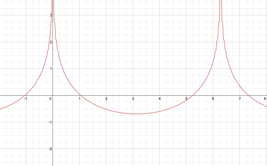
Coda: The real and imaginary parts of $\sum \frac{z^n}{n^2}$ and $\sum \frac{z^n}{n}$ also look like Fourier series, no? Here, for instance, are the graphs of $\sum_{n=1}^{100}\frac{\cos nx}{n}$ (left) and $\sum_{n=1}^{100}\frac{\sin nx}{n}$ (right):

In particular, it looks like $\sum \frac{z^n}{n}$ diverges only when $z = 1$ (where it becomes the harmonic series). Can you find the functions to which its real and imaginary parts converge away from multiples of $2\pi$? Click on the graphs and try!